Copyright @tell-creative.com
Purpose
Argent | Annual Report
A magazine-style annual review celebrating success
Think
Argent LLP’s Marketing Director, Steve Alderson, wanted to share and celebrate the business’s achievements over the last year with staff and potential stakeholders.
The mood of the piece needed to be easily accessible, and definitely NOT corporate. The recipients should want to spend time reading in-depth articles or pick-up and put-down and cherry pick juicy facts and stats, whilst also getting a flavour and tone of how Argent conduct themselves.
We proposed creating an eclectic magazine-style approach which could be both engaging and easily digestible. The client already had a suggested name for it, Purpose; which we all agreed gave it a dynamic energy.
Create
The creative challenge here was to bring together a number of different stories based around 6 key areas – what Argent defined as their ‘Principles for Responsible Development’.
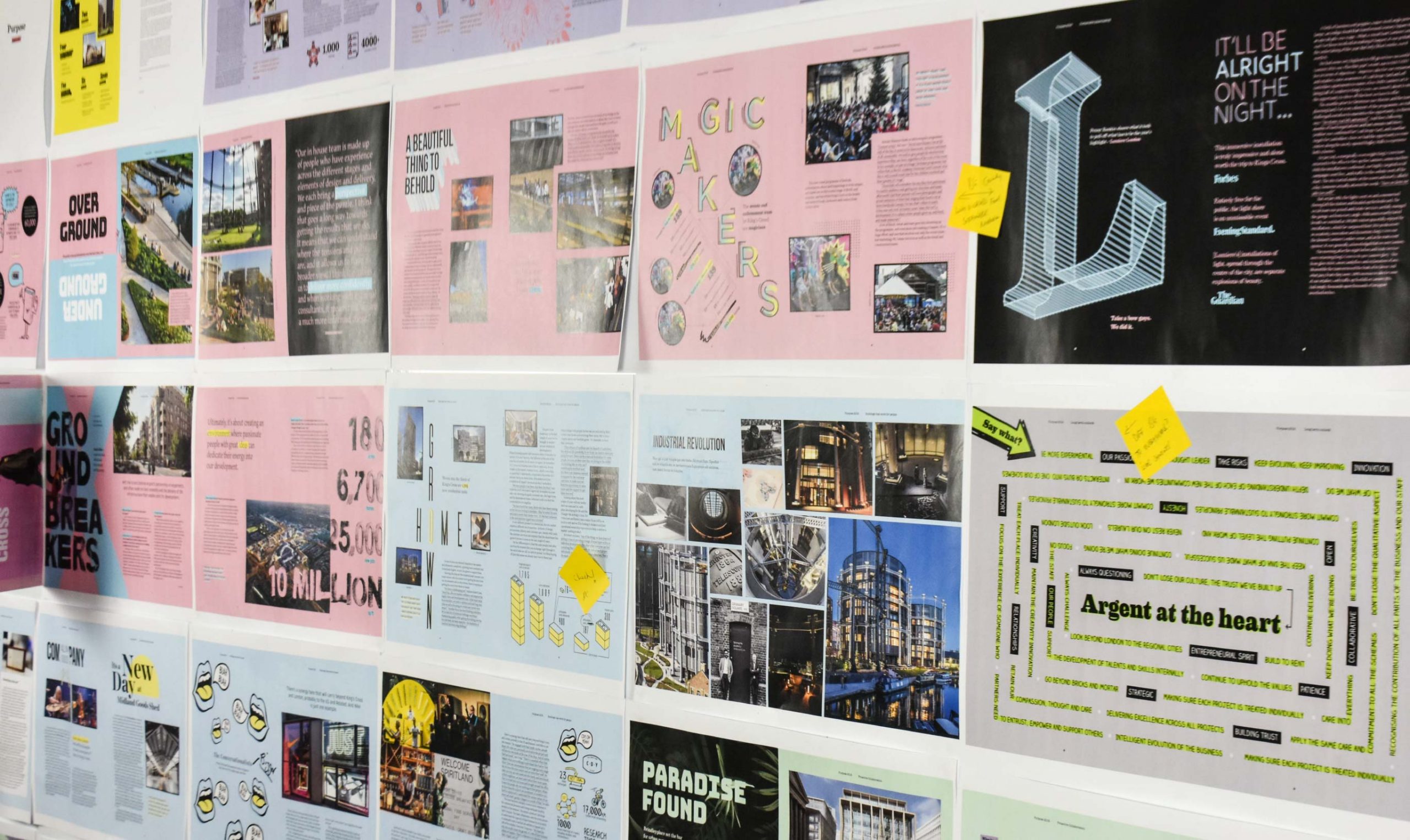
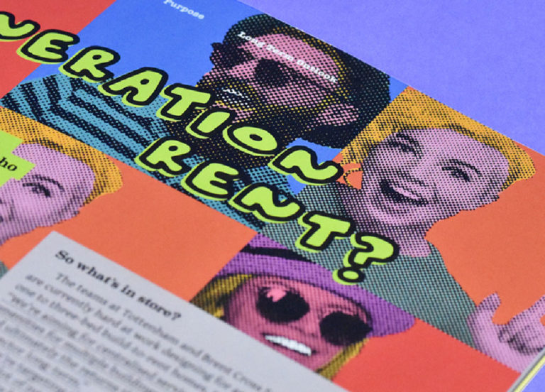
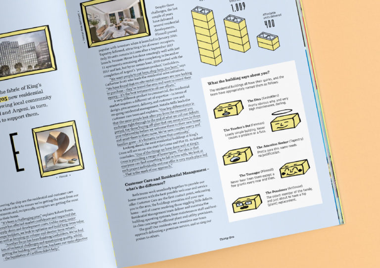
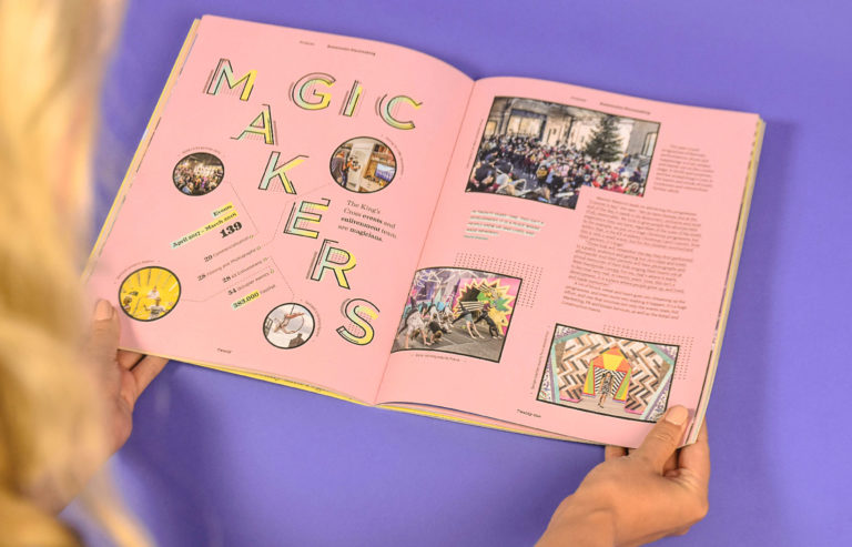
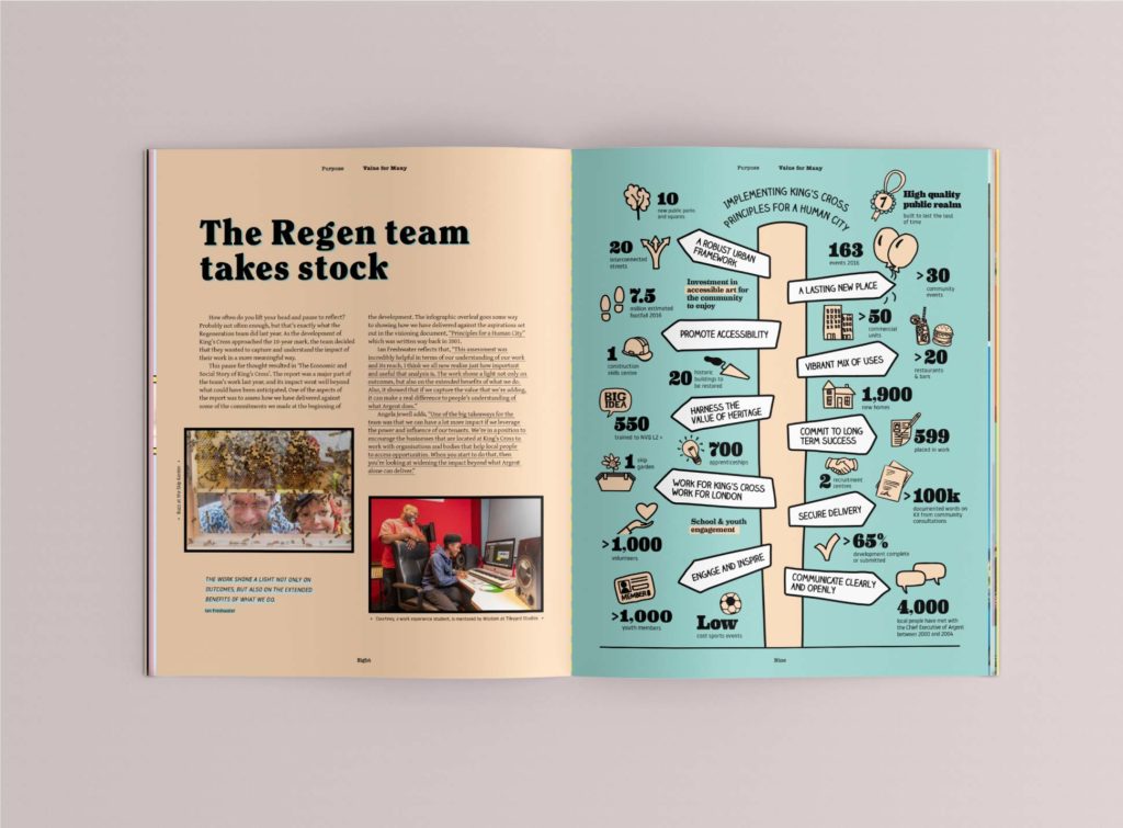
We created a bespoke colour palette to give each principle its own special feel and distinct identity; they formed the sections of the magazine. We gave each article its own identity, achieving this through bespoke heading typography to set the tone for the piece and bespoke illustrations to help bring the story to life and create visual narratives.
Tell
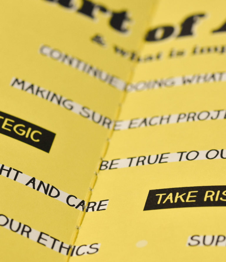
It was agreed that the printed piece should have the physical quality of a magazine with a soft cover. We selected uncoated papers and a stitched spine using a bespoke thread to create a tactile reading experience, making the magazine easy to flick through as well as to read at length.Purpose magazine was to be available to visitors in reception areas of Argent’s offices and every member of the staff would receive a copy. Feedback was very positive with 80% of readers asked saying they would read it again.
Seeking assistance with a corporate magazine or report – give us a shout.
Argent LLP’s Marketing Director, Steve Alderson, wanted to share and celebrate the business’s achievements over the last year with staff and potential stakeholders.
The mood of the piece needed to be easily accessible, and definitely NOT corporate. The recipients should want to spend time reading in-depth articles or pick-up and put-down and cherry pick juicy facts and stats, whilst also getting a flavour and tone of how Argent conduct themselves.
We proposed creating an eclectic magazine-style approach which could be both engaging and easily digestible. The client already had a suggested name for it, Purpose; which we all agreed gave it a dynamic energy.
The creative challenge here was to bring together a number of different stories based around 6 key areas – what Argent defined as their ‘Principles for Responsible Development’.
We created a bespoke colour palette to give each principle its own special feel and distinct identity; they formed the sections of the magazine. We gave each article its own identity, achieving this through bespoke heading typography to set the tone for the piece and bespoke illustrations to help bring the story to life and create visual narratives.
It was agreed that the printed piece should have the physical quality of a magazine with a soft cover. We selected uncoated papers and a stitched spine using a bespoke thread to create a tactile reading experience, making the magazine easy to flick through as well as to read at length.
Purpose magazine was to be available to visitors in reception areas of Argent’s offices and every member of the staff would receive a copy. Feedback was very positive with 80% of readers asked saying they would read it again.
Seeking assistance with a corporate magazine or report – give us a shout.
